Your business card is your first impression. It should help you get noticed and be remembered. So, when it comes time to utilize your services / product / business, people think of you first because of that awesome card you left behind. But more than that, business cards are an opportunity to display your personality and spark a conversation.
This article from entrepreneur.com states “The business card is the most powerful single business tool–dollar for dollar–you can invest in.”
If business cards are an investment, then when it comes to printing, invest in a long-term plan, and don’t get stuck on the “bottom line” of what the printing will cost. It’s actually less expensive to print more cards at one time (think thousands, not hundreds), than it is to print a small amount now, then re-print again when you run out. And trust us, you will run out.
Don’t be afraid of those cool printing techniques, high-quality papers, and conceptual designs.
And don’t just go for the design that is the cheapest to produce. Sometimes the difference between the “over-the-top” design and the “most cost-effective” design is just a couple hundred dollars, which can be mere cents per unit. Again – think about the long-term investment.
The Most Important Step
Hire A Professional.
If you’re a plumber, no one expects you to bake an amazing wedding cake for their wedding. The same goes for designing business cards. Be honest with yourself, and stick to what you’re best at… which is probably something really important that the rest of us are not-so-great at. Like plumbing.
Hire a designer, or a full-service agency, to design your business cards. Allow a professional to take care of this for you, so you can spend your time doing what you’re best at.
Show them examples of your favorite cards, colors, papers, etc to help guide the design process. But ultimately, they’re the experts, so encourage them to suggest their own ideas as well.
Now, let’s get the creative juices flowing. Whether you’re a business owner, a graphic designer, or an aspiring entrepreneur, let these 5 tips guide you through the important process of business card design.
1. Be Bold: Use Color and Typography to Your Advantage
Consider the brand you’re designing for, and who the cards will appeal to (aka, the target audience). Make creative use of the logo… there really aren’t rules! Of course, follow any existing brand standards, but don’t be afraid to push the limits.
This example uses big, bold colors, creative typography, and unique uses of the logo.

Notice how this card for business consulting group The Missing Link uses only part of the “O” logo, for an even more interesting effect. Big and bold for the win!

2. Think Outside the Rectangle
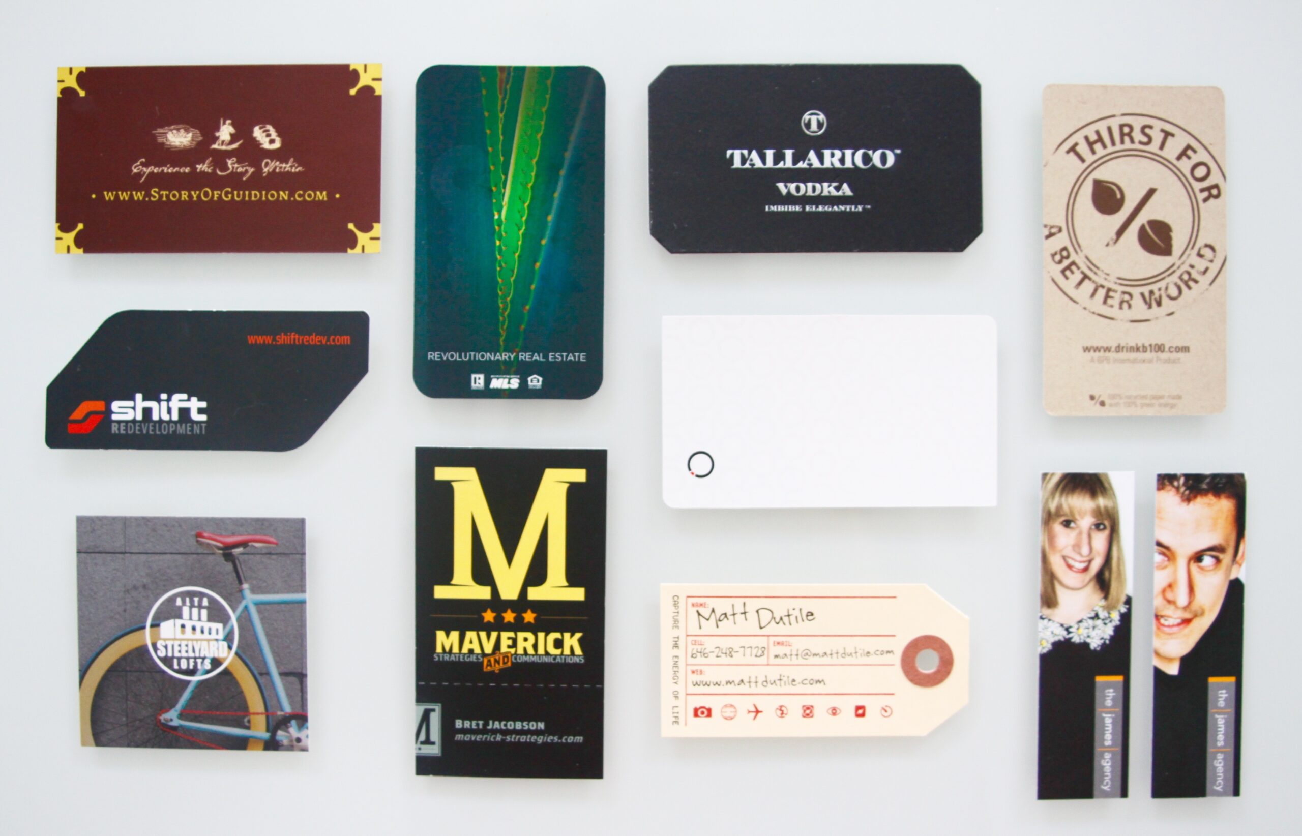
Card after card that your prospective clients and new contacts receive are probably the standard 3.5” x 2”, square cornered rectangles. While there’s something to be said for not fixin’ what ain’t broken, there’s also value in thinking differently about card trim. Check out these examples of different shape and size card options that will help you stand out.
A custom die-cut gives this card for Shift Redevelopment an edgy and aggressive style.

These cards for travel and lifestyle photographer, Matt Dutile, are printed on vintage-style luggage tags, consistent with his travel-centric business concept.

3. Make Your Design Shine… Literally
Talk to your printer to learn about their capabilities and equipment. New digital printing techniques provide cost-effective ways to add cool finishes to your business cards. Foil and Spot UV are just a couple of the ways to add some shine to your design.
Gold foil adds pizazz to this medieval-inspired calling card. A die (a custom element that your designer and printer create) is used, and heat and pressure are applied to transfer the foil onto the paper. There are tons of different types of foil, and you’re not limited to just metallics. Ask for a sample booklet to see the possibilities.

Spot UV makes this Keyland Properties logo appear subtle and shiny on a cool photographic background. This technique adds glossiness to a specific area of the design to create a shiny contrast against a matte paper finish. This technique also uses a die to apply the coating, and UV light to dry and harden it. The result is awesome, but really only works with thick paper stocks (aka, Cover weight)… see Tip 5 for more on paper.
![]()
4. Paparazzi Style: Make Creative Use of Photography
Head shots… they’re not just for Realtors anymore. Nothing adds personality and memorability to business cards like a photo. But don’t get stuck in the rut of using the same old boring head shots.
This Keyland Properties card uses black and white photography in a film-strip-style layout to show movement and add recognizability for each team member.

These The James Agency cards use photography that showcases their big personalities and creativity.

Also, consider using photography as a design element or background texture. The grungy feel of the photos on these Alta Steelyard Lofts business cards is consistent with the industrial architecture of their property.

5. Get Touchy-Feely…With Your Paper
Make your business cards appeal to as many senses as possible. No, we’re not talking about tasting your business cards…weird. We’re talking about paper! There are endless paper possibilities, so get creative and select a stock that best supports your design concept.
Here’s a basic Paper 101 overview:
Thickness: The two main types are Text (or Book) weight, and Cover weight. For business cards, steer clear of Text weight stocks, which are too thin. Use at least an 80 Pound Cover stock (we recommend 100 or 120 pound). A designer can recommend options that are best for your card.
Color: Each paper manufacturer has a rainbow of colors, ranging from shades of the white and beige families, to gray, natural, neon, and everything in between. Keep in mind how your design will look when printed on a color other than white, and embrace paper diversity.
Finish: Textured papers make a big impact, and can take your business card to the next level. We love Neenah Classic Laid papers, which add a subtle texture that stands out from the standard smooth finishes we usually see on business cards.
These cards for Tallarico Vodka use a super thick, super high-quality black paper that’s fitting for a high-end product.

Cards for an eco-friendly water bottle are printed on earthy, 100% recycled craft paper.

So, there you have it folks. Our advice to help you design professional business cards. Now, get to networking!