The fact that you are here shows you have already taken a big step in the process to fix your website design or landing page. Recognizing you have a busy, cluttered, non-optimized website is the first step to fixing the problem. Now, what should you do about it? Start by reviewing your page or site and asking yourself the following questions:
- What is the goal of the website or page?
First thing’s first; to optimize your website, you need to know what you are optimizing it. What is are you trying to achieve? Write it down. Every decision you make going forward should be decided with this website goal in mind. Ask yourself, does this help us accomplish our goal of xxxxx? Your goal should be as specific as you can make it. It should not just be “increase sales” or “capture more leads”. A good goal provides context. An example of an effective lead goal is: Increase the number of email addresses of our primary target audience of male students 18-21. - Is that paragraph necessary?
Once your goal has been determined, start reviewing the content on your page and deciding if it is necessary to achieve your goal. Is the information needed to convince a potential customer to fill out the form? Or is it on the page because someone within your company would like it mentioned? Too much information can confuse a website visitor and sidetrack them from completing the intended goal. - Is it logical?
Your website should lead visitors down a path that is logical and answer their questions along the way. They should be able to quickly find the information they need. If they are confused by the website navigation or page layouts they are more likely to leave the website for another easier-to-use site. - Is it easily skimmed?
Research shows the majority of website visitors skim the content on the page. Headlines, sub-headlines, lists and bullets are great ways to break up the content and make it easier for your customer to quickly find the information they need. This makes them more likely to make the decision to convert. - Is there a cohesive system to the colors?
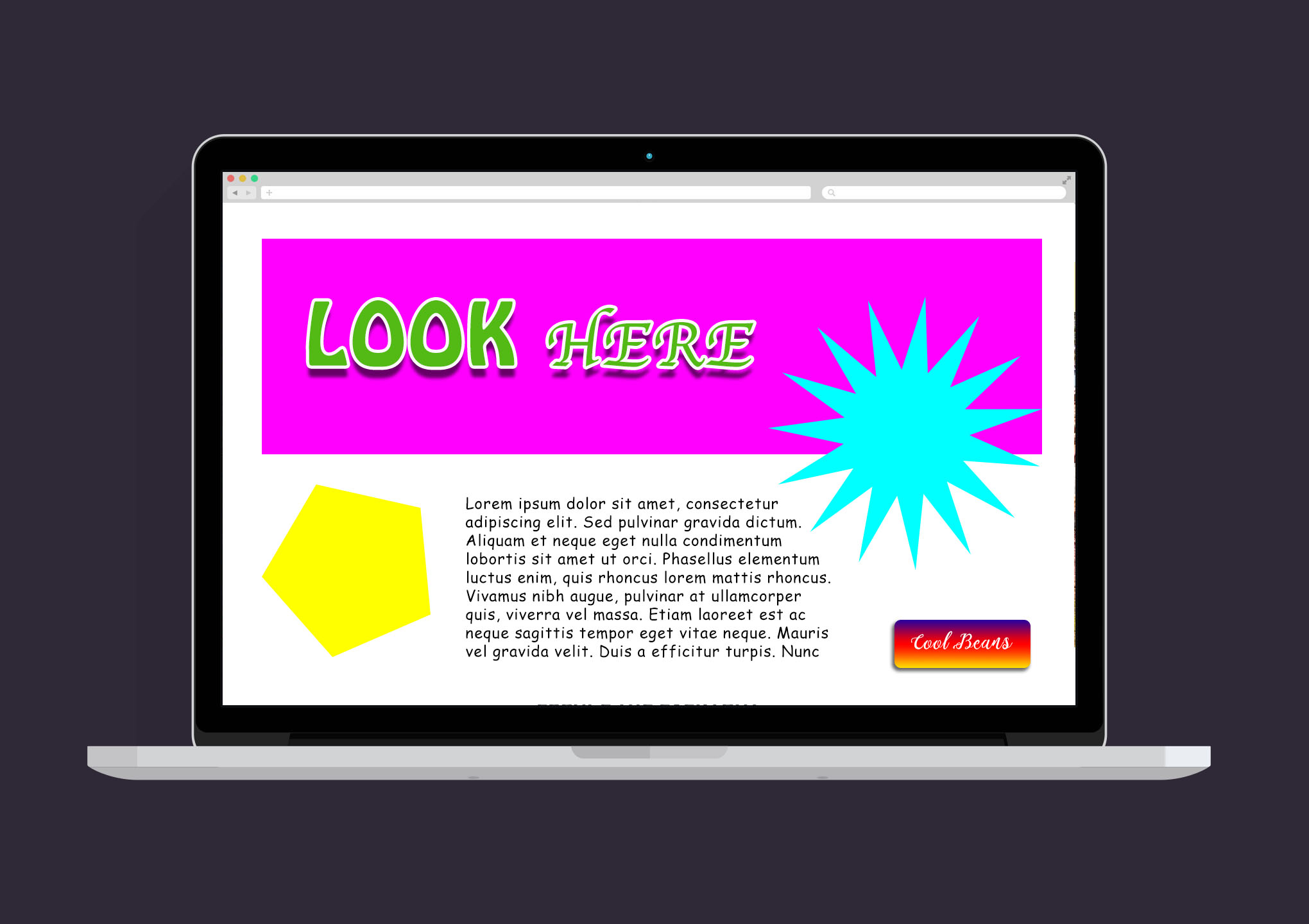
Having a clear color system allows your customers to quickly consciously or subconsciously understand the order of the page. The more organized and familiar the page, the easier for the brain to understand what to do next. Whether they notice it or not, an example is if green buttons always move the customer forward through the process. A system like this causes the mind to start looking for the next green button to continue moving forward. - How many fonts are on the page?
Similar to the color system mentioned above, having a clear order to the type on the page also helps simplify the content and make it easier to skim. Streamlining the headlines with a standard font, font size and color quickly simplifies and organizes the page. - Can the user find all the information they need to make a decision or do they need to contact you?
In some industries, the best way to increase leads is to provide the visitor just enough information to be interested and feel confident enough to reach out to you—but not enough that they can do all their research without ever giving you their information. Depending on your business model and industry, you may need to provide more information so the customer can compare you to competitors. Going back to your main goal determined at the beginning, put yourself in your potential customers’ shoes. What information do they need? What is extra information they don’t need to convert?
Conclusion
When in doubt think: simpler is better. Too many fonts, colors, content and photos can distract the potential customer and keep them from converting. Just because there is space on the page for something doesn’t mean it should be there. Not sure where to start? Hire an expert to help organize and reorganize your pages to increase conversions.