“A user interface is like a joke. If you have to explain it, it’s not that good.” – Marin Leblanc.
As humans, we have expectations and standards, and when UX (User Experience) does not meet those expectations and standards, it can leave a bad taste in our mouth with that brand. We’ve all dealt with the dreadful 404 Error or had a complicated booking experience. Whatever it may be, we’ve all struggled through (sometimes) awful UX that has ultimately changed our opinion of that brand. With that in mind, I’m here to fill you in on some of the simplest and most impactful UX tricks.
Nielsen Norman developed 10 UX best practices that should be incorporated into your website. Here are 5 of my favorites.
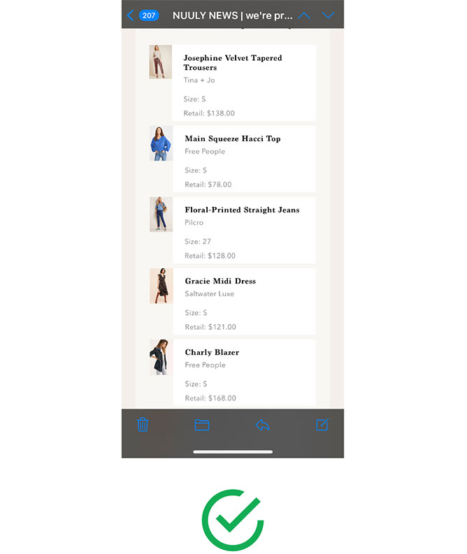
The email confirmation from NUULY shows visuals of each item I just bought. Thank you NUULY for understanding that a shopaholic simply cannot recall every item they have bought.
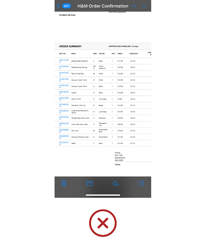
H&M only lists names, which is useless when I have three “Cotton T-Shirts” in one order.
Error messages are common. However, a user-friendly error message is not so common. It’s one thing to let the user know that a problem occurred, but it’s another to offer a recovery process, or better yet, tell them what exactly happened. We’ve all received an Error 404 state, or an “oops something went wrong” message. Which leads us to thinking “Okay great.. what went wrong? How do I fix it?”
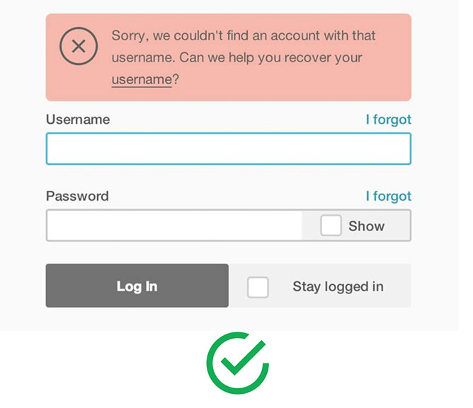
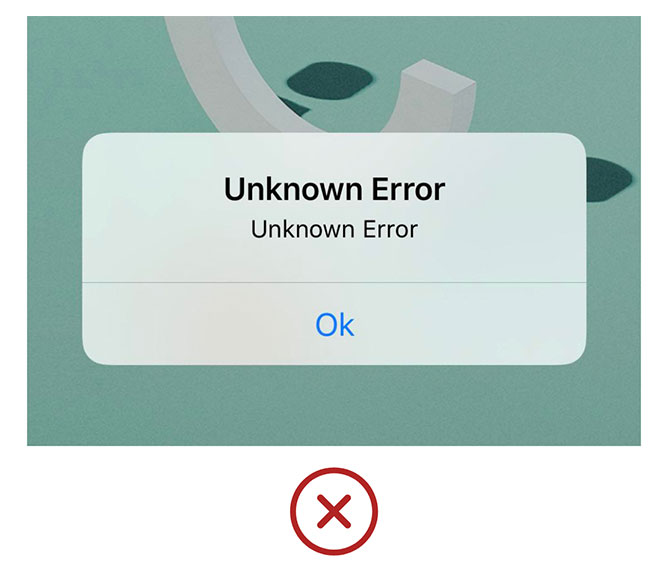
Mailchimp not only shows what went wrong, but also offers a path to recovery. Snaps for Mailchimp.
We all love a little reassurance and validation, right? While a website can’t tell me how amazing I’m doing or how beautiful I look today, it can offer some encouragement by showing me how much longer I have to go and/or what’s been completed so far. This communication provides trust between a brand and a customer. System feedback is also important for success as it offers the user more control when there’s a progress after their actions.
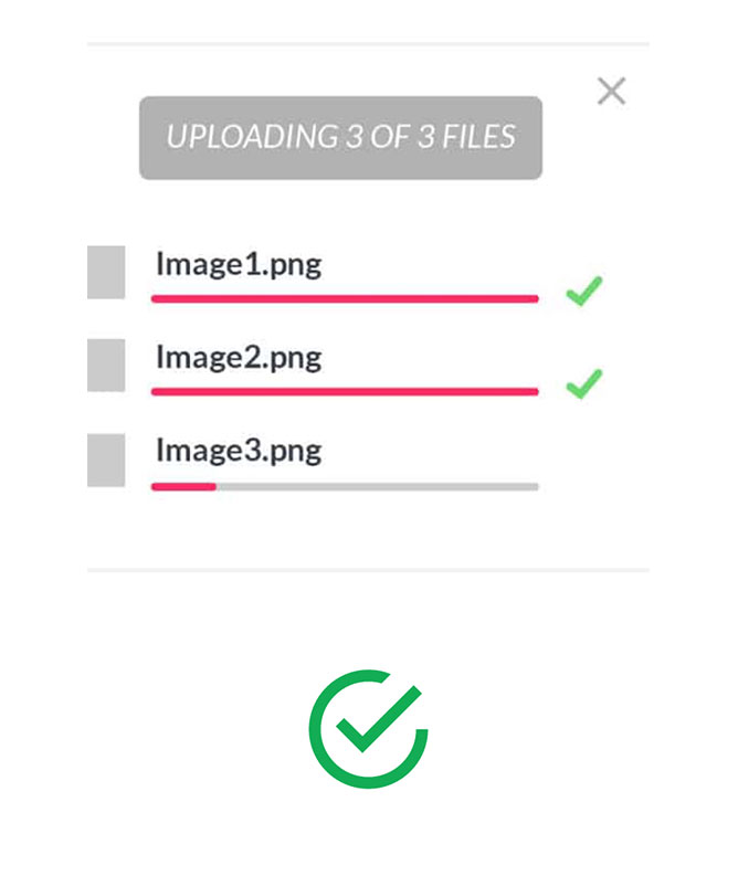
Take a look at this example. This loading state shows me my upload progress and also shows me which ones are complete.
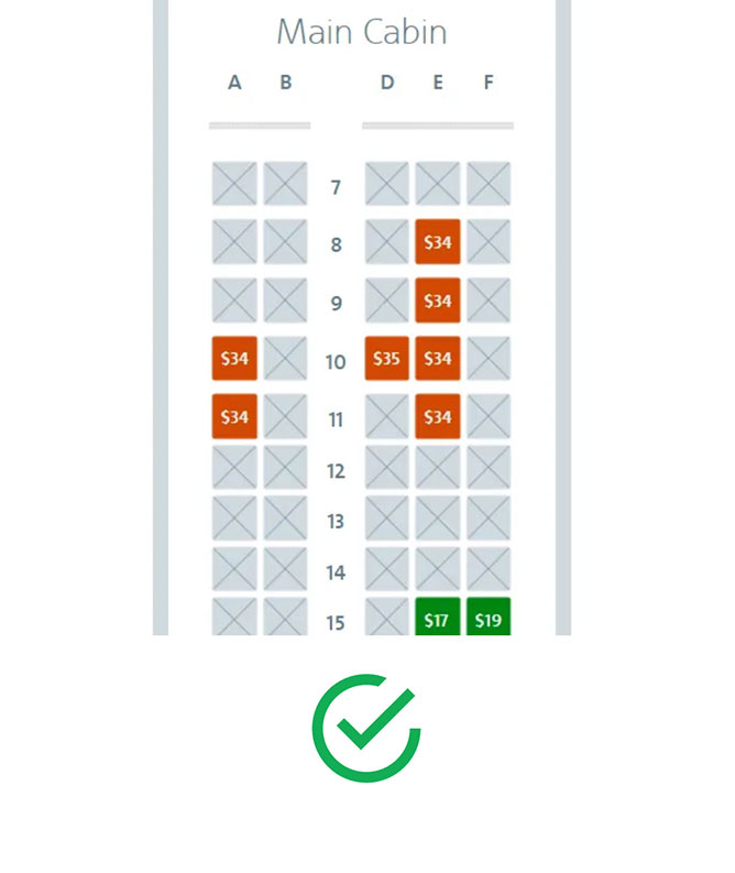
American Airlines is transparent about which seats are available and their prices. As a Southwest regular, this kind of UX has me sold on trying out American Airlines for my next travels.
Sometimes being told what to do can make us feel trapped in a corner, like when my laptop reminds me for the 9th time that a software update is available. Thank goodness for that “Remind me later” option, because just like my alarm every morning, that update needs to be snoozed. Which brings me to User Freedom. As a designer, I need to remember that people make mistakes-by offering users the freedom to undo, go back or cancel, we empower them and build trust.
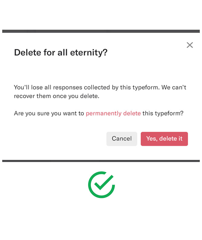
Check out this pop up: both a cancel button and an exit icon in the top right. Including a cancel button doesn’t mean you should omit the “X” in the top right. Industry standards suggest that many users will look for an exit instead of a cancel button. Offering both optimizes a user’s freedom.
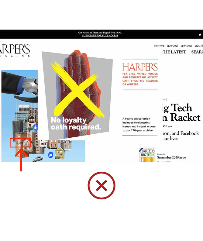
Hmm. I spy a close button… it’s okay if you missed it. So did everyone else that visited this site. This kind of poor placement gets overlooked by the user, leaving them feeling cornered in their decision or completely leaving the page.
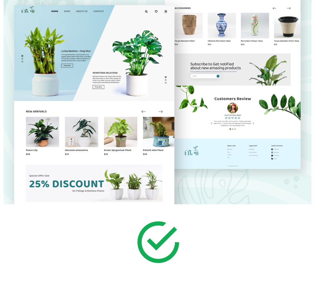
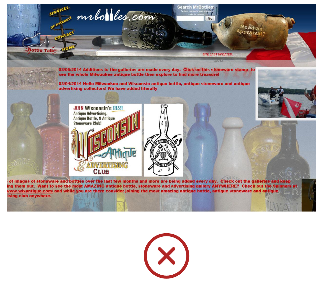
There’s something called “choice overload”: if provided too much information, we go into an analysis paralysis. If you’ve ever browsed for 45 minutes trying to find a movie to watch, then you know exactly the feeling I’m referring to. To avoid giving your users too much information where they feel stuck, it’s crucial to maintain a balance between minimalist and ornate web design. It’s important to note that this doesn’t mean a design has to be flat or monochromatic, it’s simply an emphasis on making sure the content is relevant and placed in a hierarchy that makes the most sense for a user’s flow. Below is a comparison of a site that aesthetically displays information in a minimal manner, and one that is overall more ornate and busier.
![]()
Now that you have a better idea on what makes your reservation process on Airbnb so smooth, or how you seem to stay loyal to your favorite music app, it’s not just because you’re used to it-it’s because these brands work really hard on making sure they match your needs throughout your experience.
Wondering if your website meets my top 5 UX rules? Or want to simply enhance your site and your brand’s experience? Give us a call!

